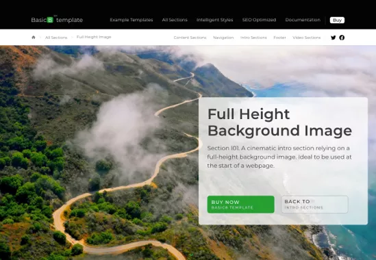
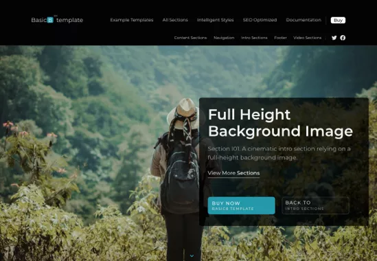
Full Height Background Image
Ideal as the first section immediately after the navigation. It creates a stunning cinematic effect. Section I01.
Full Height Container
A beautiful minimalist full-height container, designed to look astonishing at the beginning of a webpage layout. Section I04.
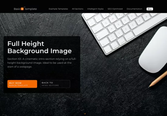
Full Height Background Image V2
Left aligned overlay box over a fully stretched background image. No secondary navigation & no breadcrumb. Section I02.
Full Height Container V2
So simple! Apply a single property to the desired sections to create a beautiful black full-height layout. Section I04.
Full Height Background Image V3
Secondary navigation pushes the background image. Therefor the secondary navigation div is not floating over the image. The overlay box has white automatic style. Section I01.
Full Height Container V3
Be creative! Easy! Explore various designs by simply applying one of the 5 automatic styles to the full height section, or to the webpage navigation or subnavigation. Section I04.
Center image with text on left & right
A layout optimized to highlight benefits or features to the left or right of an image. Section C27.
Large image on the left
Bring the focus on a reasonably large left image while listing key aspects on the right. Section C01.
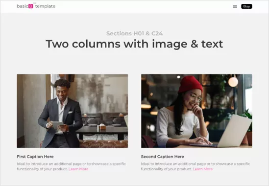
Two columns with image & text
A balanced design where equal size and spacing is allocated to two images on a row. Section C24.
Large image full width
This design can be used to present a large image such as a screen capture or large product image. Section C18.
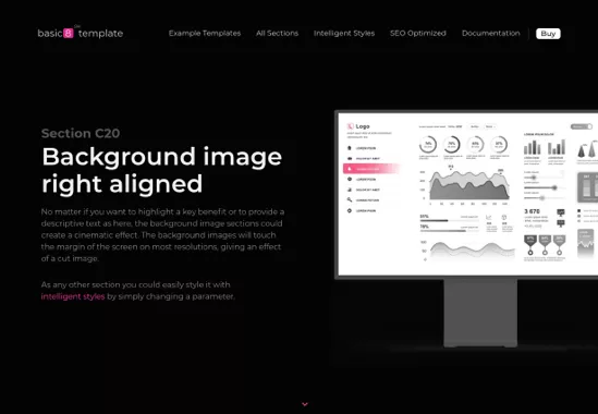
Background image right aligned
A simple way to create a dramatic "cut" effect by specifying a background image in the CSS. Section C20.
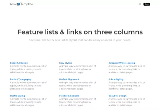
Feature lists & links on 3 cols
Most content sections can be used as an intro. For example, the 3 cols could be used for a FAQ webpage. Section C15.
3 columns with image & text
Ideal to be used as the first section immediately after the navigation. It creates a visual cinematic effect. (section C25)
More Sections
See many more sections which you could use to create a unique, clean, and professional landing page.
The next examples are covering special full-height use cases, such as an example subnavigation without breadcrumb menu or two predefined HTML and CSS formatted overlays.
Full Height Background Image v4
The secondary navigation it is floating over the background image. The white style it is applied to the overlay and to the main and secondary navigations. Section I01.
Full Height Background Image v5
Secondary navigation is without breadcrumb and it is not floating over the background picture. Black styles are applied both to the navigation and to the overlay. Section I01.
Full Height Background Image v6
Two overlays are placed on top of the background image. Each overlay could have its own content, call-to-actions, or links. This variant has no subnavigation. Section I03.
Use one of our predefined Basic8 templates or build your own web page design by simply selecting and adapting the intelligent Basic8 sections.