Automatic Styles Easy to Use
Just change a parameter and the style of a section / entire page will automatically adapt:
Two major look & feels:
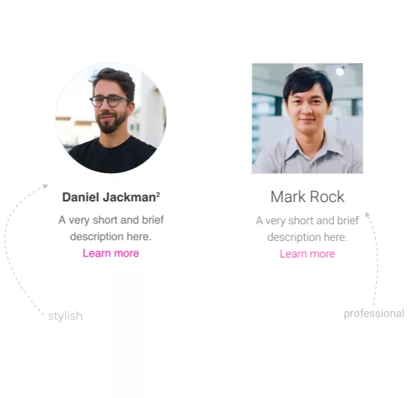
for MacOS & iOS enthusiasts Professional
for Material Design lovers
Just change a parameter and the style of a section / entire page will automatically adapt:
Apply an overall look and feel to any page of your website. This will influence shapes and fonts throughout the webpage.
We've built the same page in the two available look and feel options. This way it's easier to get a better understanding of each.
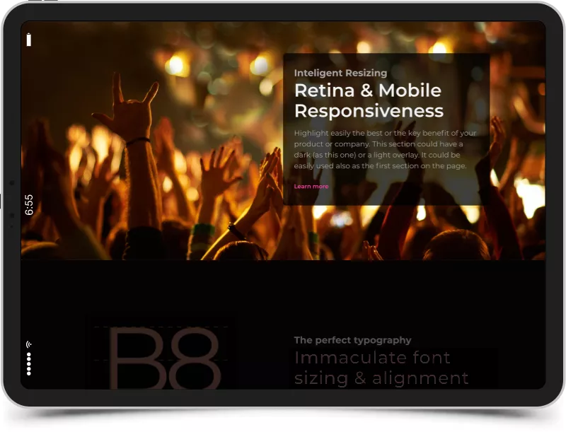

It sets the mood and establishes hierarchy. Typography is as important as colors as it helps attract and sets your medium of communication.
Enhances hierarchy and highlights groups and blocks. And your visitors can easily scan your page.
Your website should have enough room so it doesn't feel cluttered, while helping your visitors focus on the core content.