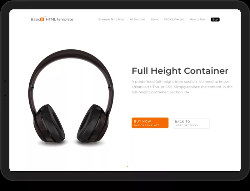
Designed with conversion in mind
A HTML template build to create high converting landing pages for your products or services
SOON
To Be Available Learn About
SEO Optimizations

A HTML template build to create high converting landing pages for your products or services
Basic8 HTML template was built by experts in UX & conversion optimization from scratch using the best practices in design for conversion rate optimization. The team that designed the conversion optimizations behind the Basic8 template has over 10 years of experience in user research, conversion funnel optimization and product design for both B2C and B2B. Therefore, the first step in designing this template, much before making it to look beautiful, was to design it for building a high converting landing page. 1
Learn more below about just few of the Basic8 features aiming to support your conversion goals and strategy.


Hero Sections
Use the predefined hero sections to create a converting focus point at a begining of your landing page.

Testimonials & Social Proof sections
Support your product or services with endorsements and social proof by adapting these sections.

Features & Benefits Sections
Plus many more predefined sections designed to increase conversion. Check out all sections for more examples!
Some of the best converting landing pages rely also on contrast for clarity. The use of contrast could help you to accentuate key actions, features or benefits, and ultimately to drive leads. As you can see from the provided example templates, Basic8 template achieves this formidably well. Learn more in the style guide about how easy it is to automatically style the contrast of sections of a landing page.

The Basic8 website navigation automatically accentuates your key call-to-actions by removing potential distractions on scroll. It does this by collapsing the navigation menu under a hamburger menu, while increasing the focus to your call-to-actions. Learn more about the navigation.

Such as this section, that can be automatically adapted to various styles and colors.
It is a well-known practice that the usage of a video on a landing page could increase sales and conversions tremendously. Showing your product, application, or service in action on your landing page could greatly contribute to driving leads. Therefore, in addition to a wide number of predefined HTML sections, the template also contains predefined video sections. The examples presented include carefully designed video sections, including examples on how to embed a YouTube, Vimeo, or a self-hosted video.
Learn more

Nobody likes to be bombarded with a lot of information, flyouts, buttons, links, call-to-actions, or lots of menus. We all experienced the annoyance of wasting time while searching for the desired information. Therefore, from inception, the Basic8 layout and its individual sections were designed to not overwhelm visitors. Instead, they will help you to create an effective landing page, that encourages visitors to take action. See this by yourself by visiting Basic8 sections or templates.
based on best conversion practices
Provide context to user, an easy access to relevant information, and prevent them to get lost while navigating through your website pages.
A high converting landing page should allow visitors to easily scan the content and to understand the key information at a glance. The Basic8 sections does exactly this as you could see here.
Our simplified and minimalist approach will help you to make your message clear. Most of our sections have dedicated areas where you can specify a clear and concise message.
If you want to support better your claims or to dissipate visitor fears, you could easily provide a subtle additional description for key headlines or call-to-actions.
Use the provided predefined placeholders to replace them with your own high-converting headline that should be relatively short, easy to be understood and crystal clear.
Simplicity by design was a key principle embedded in the architecture of the Basic8 template. Check out the example templates to see this in practice.
Predefined CTAs designed based on best conversion practices. Thus, ensuring that the buttons stand out, that there is enough space and high contrast around the buttons.
The template is using large headers and it allocates large space for large cinematic imagery. This will help you to create a visually striking landing page.
Conversion best practices outline that fast-landing pages convert better. Click here to learn about how fast our template is.
Keep your crucial call-to-actions above the fold by using the intelligent auto-sticky navigation design, or the carefully designed full-height.
The consistent look & feel, together with predefined spacing, will allow you to keep a visual consistency across your web pages creating a predictable experience for your visitors.
Not one, but two styles are available, each of them designed to build trust. See the differences between these two high quality styles (professional and stylish) in the style guide.