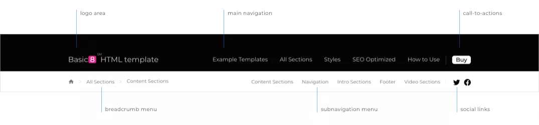

Basic8 website navigation & subnavigation design approach aims to create an unhindered user experience, while accentuating in a subtle, non-invasive your key call-to-actions, therefore seeking to support and increase your overall website conversion.1
To ensure an uncluttered experience for the users, and a clear focus on key call to actions that might be in the header of the page or on the page, the less relevant information is hidden away for the users. Therefore, on scroll the subnavigation it is pushed up together with the content of the page. On the other hand, the main navigation bar will be automatically collapsed behind a hamburger menu, yet, still easily accessible at any time. The main navigation will revert to its normal state if user navigate back to the top of the page. Furthermore, for supporting conversion, permanent call-to-actions such as the “Buy” button will be available on most scenarios even after the main navigation will be collapsed.
Designed with attention to details, the Basic8 template navigation system (including the sub-navigation bar and the breadcrumb menu) aims to support a multitude of viewports (such as rendering on small mobile viewports, on table devices (no matter if the positioning it is portrait or landscape), or on huge retina screens.
From concept, we considered best practices and subtle rendering challenges such as how the navigation and layout will respond to a mega-wide monitor screen, with or without a high pixel density.
While creating the layout and the navigation responsiveness concept we had in mind 3 objectives: beautiful land professional look & feel, simple and easy to use, and, support for driving conversions.
Automatically transform any webpage navigation or sub-navigation to various styles/colors by applying a single parameter. Learn about Basic8 types of website navigation by checking the examples below:


Our navigation and subnavigation template can be adapted for each webpage individually. Therefore, you will decide if you want the same global look and feel on all your webpages, or, if you will go for a different navigation or subnavigation look & feel for a specific page. You could even decide that for specific webpages you might not want entirely the subnavigation or the breadcrumb as in the examples below.