
Black & White Template
A stylish web template based on black & white section rotation. Typography was set to "stylish" to create a look and feel for Apple & iOS enthusiasts.
DOWNLOAD FREE
LIMITED Template SOON
Premium Edition
A stylish web template based on black & white section rotation. Typography was set to "stylish" to create a look and feel for Apple & iOS enthusiasts.
Others have seen what is and asked why. I have seen what could be and asked why not.
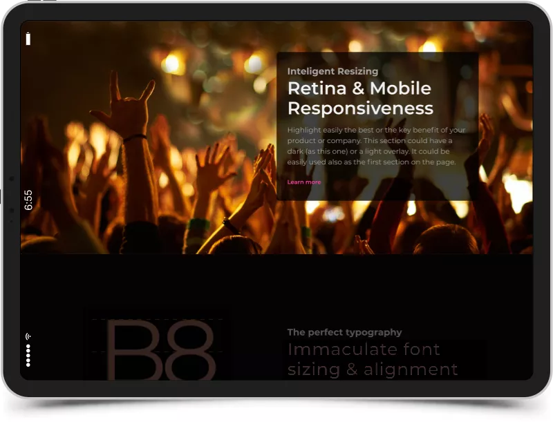
This section was designed in such a way to ensure an ideal vertical positioning for most scenarios in a predefined container. Your specified content, such as images or text, will be automatically placed and resized, depending on the screen.
Basic8 website template was designed with attention to details, not like other templates that break easily in a lot of scenarios. While designing Basic8 website template we did our best to create a simple and robust template.
Build with intelligent responsiveness across a multitude of devices! Basic8 template and all its sections are designed to be responsive considering both the width and the height of various viewports such as mobile, narrow, wide horizontal, vertical, or retina viewports.
Any section, such as intro sections (for example full height container), could be automatically styled with one of the two available typographic themes: professional or stylish.
To learn more about it visit the style guide.
Intentionally our sections are designed to breath space and to harmoniously manage the available vertical estate. Thus, images, text and call-to-actions fit together easy. You just need to replace the content with your own text and media.
You will need minimal HTML and CSS3 knowledge for figuring out how to create a full height section. Just reuse the corresponding full-height section clearly delimited in the code by HTML comments. In most scenarios you won't need to deal with CSS.

Built by Basic8Template.com and sponsored by Disrupthor.com
The premium edition is available on Basic8Template.com